
[Reading time: 5 minutes]
Overview
KPIs (Key Performance Indicators) are visual indicators that allow you to quickly interpret essential data from an exploration. They are used to measure performance: number of calls, average duration, quality of service, etc.

KPIs are created within each exploration in the Reporter module, and can then be used in dashboards or exported.
Note: Depending on the type of exploration selected during creation, some default KPIs may be automatically generated.
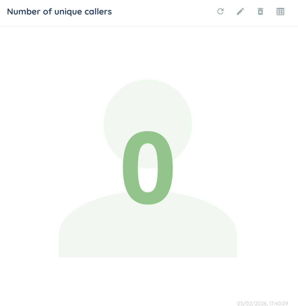
If there is no data for a KPI, it will display 0.
1. KPIs types
There are 7 KPI types, all of them explained in the following subsections.
By default, all KPIs cannot include more than 5 different data (abscissas and custom data).
Single value square
The most simple KPI, a single value displayed in a square. You can change the color and icon to customize it a little.

Multi line
A multi-line chart is used to track the evolution of multiple data series over time, and to easily compare their trends.
For a multi line KPI, you will always need two item types, and the 1st one will always be an abscissa. You can also choose to use stacked charts for specific columns.

Pie chart
A pie chart is used to visualize the distribution of a whole into parts. Each slice represents a category, with its size proportional to its value.

In order to create it, you will need an abcsissa (data groups) and a calculated data (value).
Sunburst
A sunburst chart is used to visualize hierarchical data in a circular layout. Each level of the hierarchy is shown as a ring, making it easy to compare categories and subcategories at a glance.

Table
You can display a summary table qui s’appuie sur une raw data (distribution date in our example below) and up to 4 calculated data. Each column can be assigned a specific color for quick identification.

Region chart
You can choose to display the data on a map of Europe, or of the world.

You can use any calculated data with this KPI.
Country chart
For France, you can visualize it by its departments. Data can be displayed for 3 countries (France, Spain, Portugal) by region or department (France only) within the country.

Heat map
The heatmap lets you see at a glance the point of convergence of the data, thanks to an abscissa, an ordinate and a calculated data.

It is usually advised to use a date-type data as abscissa.
Boxplot
The boxplot is used to represent the data dispersion: the median, quartiles, maximum and minimum.

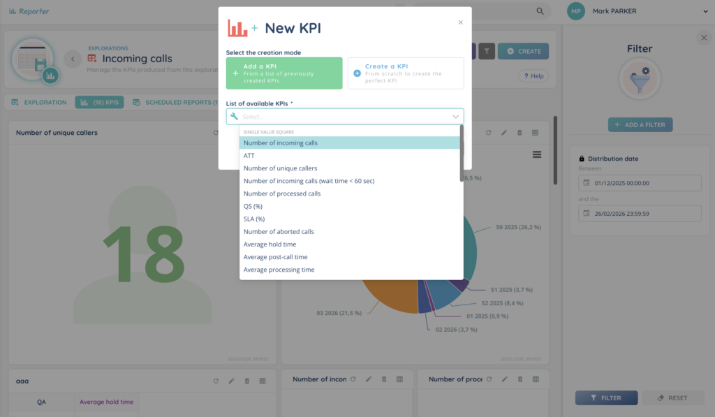
2. Adding a KPI
To add a new KPI, click the + Create button at the top of the KPIs tab within your exploration.
You’ll have two options:
Option 1: From a list of preconfigured KPIs
If your exploration was created using the “preconfigured KPIs” option, you’ll be able to select from a list of ready-to-use KPI templates.
Note: KPI templates do not concern customized explorations (e.g. cases) because they are entities created by you.
If you need more details on KPIs, see the article Terms and vocabulary.
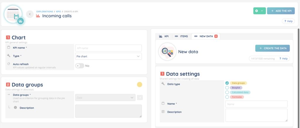
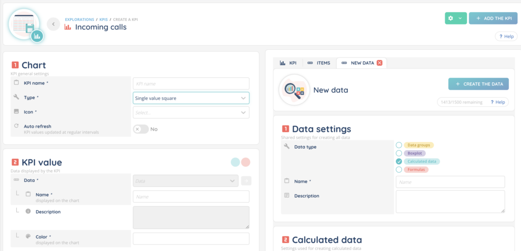
Option 2: Create a KPI from scratch
This opens a KPI creation panel where you can fully configure the indicator.
In the left panel:
- Name your KPI
- Select the KPI type, which defines the shape or visualization (e.g. multi line, pie chart, table, etc.)
- Choose whether the data should refresh in real time, and if so, set the refresh interval in seconds
- Add the necessary data items (from right panel, items tab) using drag-and-drop
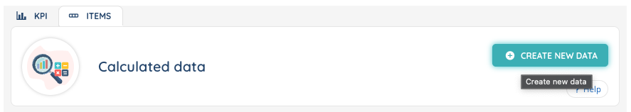
Items / Calculated data
Colored dots next to the fields indicate the type of item expected.
There are 4 item types corresponding to 4 colors:
- yellow: data groups
- purple: boxplot
- turquoise: calculated data
- red: formulas
Make sure to select the correct type in the Items tab (right panel) and drag it to the left panel.
Example: In the left panel, next to “Level no. 1” a yellow circle indicates that you must drag and drop an item with a yellow color from the right panel, items tab. (here, communication time or distribution date if you want to use already created item, called “template”).

Creating custom calculated data
If the item you need doesn’t exist yet, you can create it directly by clicking ‘Create new data‘.
Make sure to assign it the correct type (color) so it can be used with your KPI. Once created, it will appear in the list of available items.
In this example, the KPI to be dragged and dropped into “2 Data groups” on the left must be yellow (as indicated by the yellow dot), so it corresponds to the yellow data type “Data groups” on the right.
In this example, the KPI should be blue (calculated data) or red (formulas) as indicated by the two blue and red dots.
If you need more details, see the Calculated data article.
Preview
A preview of the KPI will appear in the right panel, KPI tab, as soon as the required items are added.
2. KPI Limits
There is a maximum number of KPIs allowed per exploration.
This limit is managed via the Maker, from client account settings.

3. Refreshing a KPI
To manually refresh a KPI, click the refresh icon (circular arrow) located above the KPI tile.

4. Editing a KPI
Click the pencil icon above the KPI to reopen the configuration panel and make changes.

Note: if you modify a template KPI, you can always re-add the KPI as it was before it was modified.
5. Deleting a KPI
Click the trash bin icon above the KPI to delete it permanently.

6. Exporting KPI Data
To export the data behind a KPI, click the table icon above the KPI.

Note: If you apply filters to your exploration (for example, you filter by a date range), the filters will be written to your downloaded KPI.
7. Filtering KPIs
A date filter is enabled by default.
You can add more filters from the Filters panel on the right side.

8. Changing the Layout
To rearrange the position of KPIs on the screen, click Change the layout.
You can drag and drop KPIs to organize them as needed for clearer viewing.
Note: You can leave spaces between the different KPIs, which will be retained when you save.
9. Creating a Dashboard
You can build a dashboard by selecting one or more KPIs from the current exploration.
Once created, your dashboard will appear in the Dashboards module of the Reporter, where it can be reused or shared.